Eye candies everyone?!
This latest update brings forth a livelier and more enjoyable UI experience for Bluecoins- the best finance app on Google Playstore!
The biggest change is the support for category icons. The icons are used broadly within the app, and more than just an eye candy, it’s an additional tool you can use to organize your finances. And what’s great is just click on the icon anywhere in the app to change instantly! No digging through menus or Settings.
You’ll also notice a change in the tabs with better use of the side margins for a more efficient UI proportion. The rows are also redesigned for a cleaner, cooler look.
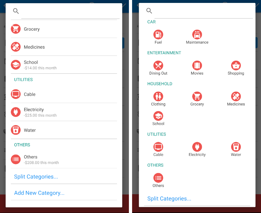
There’s also a new compact option for the category selector. Very useful especially if you have a lot of categories and find yourself scrolling or searching a lot for them. This is enabled for new users, but for current users, you need to enable them in Settings > Transaction Setup.
Here are some screenshots from the latest build. As always, if you love Bluecoins, please support it’s development by giving it 5 stars on the Playstore.
Note: If for some reason you do not like to enable icons, you can disable it in Settings > Transactions Setup > Categories
Transactions & Budget Tab. Click icon anywhere to change!
Calendar & Net Earnings Tab
New Category Selector Options
