Many new changes on v212, with focus on user interface and usability improvements. First off, let’s talk about the new icons.
Adaptive Icons Support
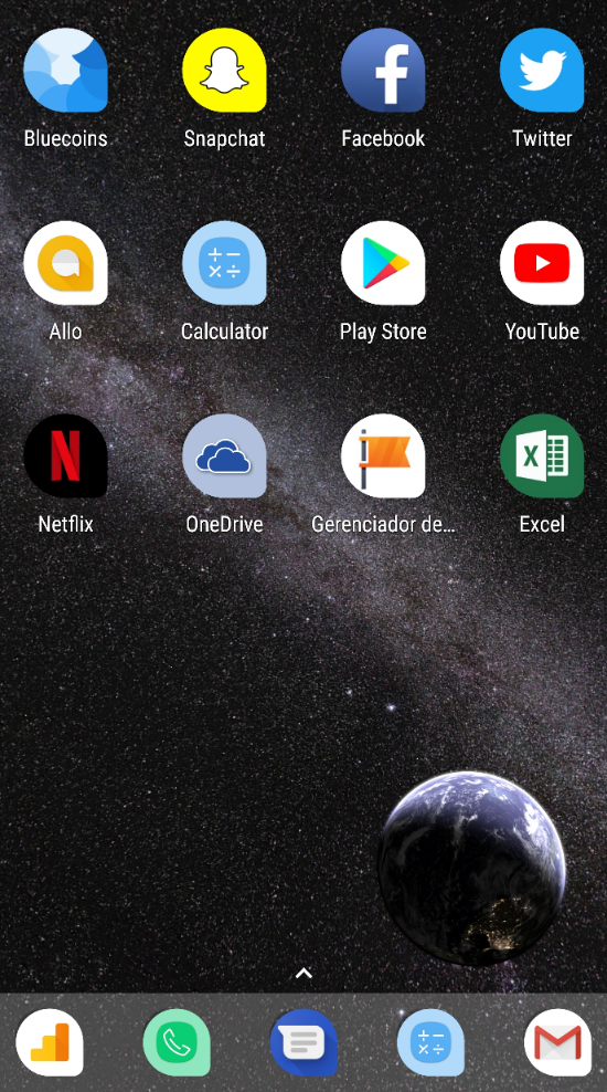
For users running Android Oreo, or even those running custom launchers that has support for adaptive icons (e.g. Nova Launcher), Bluecoins introduces a new set of icons that supports Android’s adaptive icons guidelines. Adaptive launcher icons can display a variety of shapes across different device models. For example, an adaptive launcher icon can display a circular shape on one OEM device, and display a squircle on another device. Each device OEM provides a mask, which the system then uses to render all adaptive icons with the same shape. Adaptive launcher icons are also used in shortcuts, the Settings app, sharing dialogs, and the overview screen.
Introducing the new Bluecoins adaptive icons:
Nova Launcher, even has a teardrop shape setting for adaptive icons. When applied, here’s how Bluecoins will look like along with other apps on the desktop. Note: you’ll notice apps like OneDrive or the calculator that does not have adaptive icon support are simply scaled down to fit inside the adaptive mask.
Navigation Drawer Image
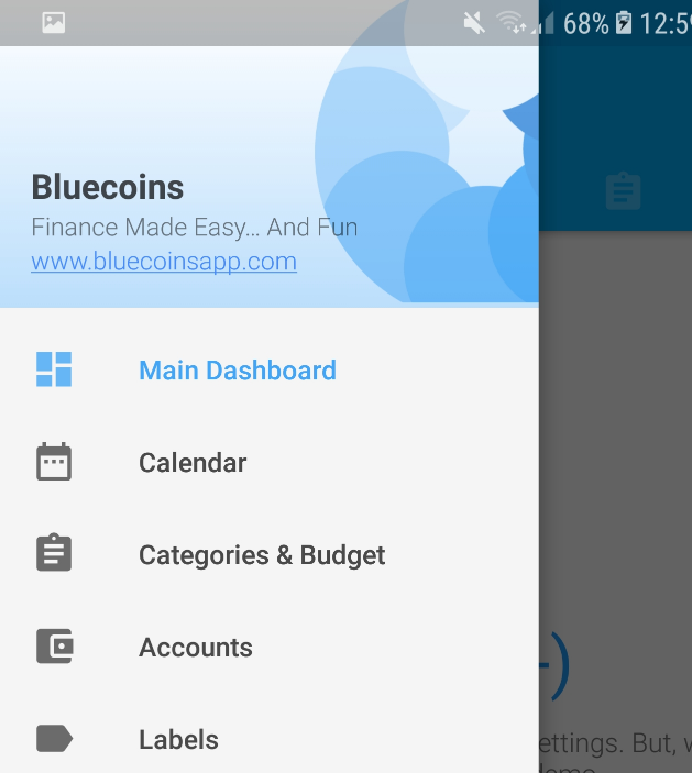
The navigation drawer image is made simpler and cleaner, to conform to the overall minimalist appeal of the app. To have a uniform app experience, the image will also adapt to the selected theme. A link to this website is also added for convenience. Do check out the website every now and then for the latest updates.
Transaction and Reminders Tab
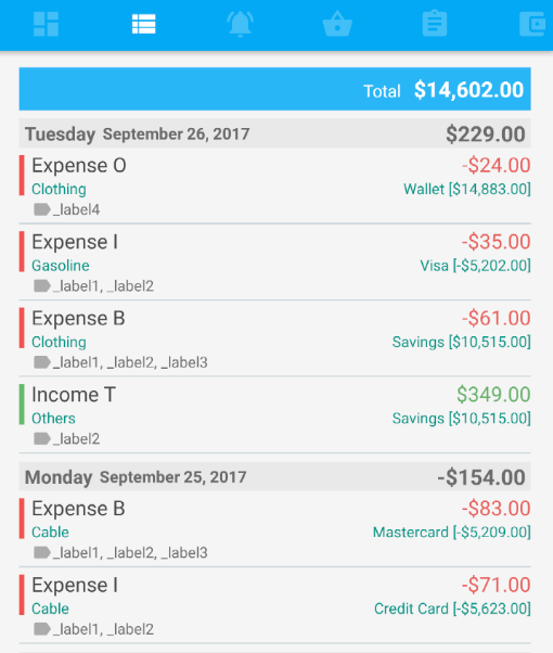
The transactions and reminders tab has also been modified. The more neutral color pattern makes it cleaner and easier on the eyes, while making the table headers uniform across all tabs.
Budget Remaining in Percentages
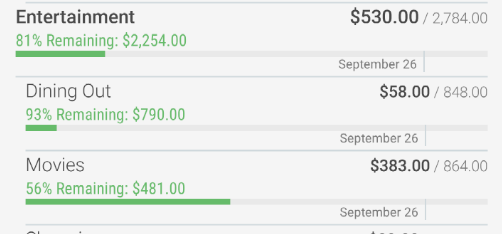
New in v212 is the ability to see your remaining (or overspent) budget in percentages. A little detail that’s added inconspicuously, so as not to create additional reading stress when you go through the budget report. The actual vs budget font styling on the right of the table has also been modified for more clarity and consistency.
Save & Add More
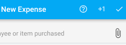
One of the most requested feature is the ability to save a transaction and create a new one without re-opening the transaction screen. You will notice a new +1 button on the transaction screen. Clicking this button will save the current transaction, and clear-up the transaction screen so you can add a new one (plus one please…).
Parent Category or Account on Transaction Screen
Quite a few users have said they have a lot of categories and some of those categories belonging to different groups have the same name. Sometimes, it’s not easy to know if I had the right category when adding a transaction. OK then, the new transaction screen will now show the group they are belonging to:
Record Reminder NOW!
Previously, when you convert a reminder into a transaction, the transaction will be created with whatever due date the reminder is currently set. V212 adds an option to record the reminder on due date (which could be long overdue or a few days from today) or record now! Very handy for those utility bill keepers.
There’s a few more UI polish in this update. You maybe able to spot a few of them.
Under the hood
Under the hood, there’s also some changes to allow for an even smoother tab transition by taking advantage of your phone’s multi-core processing. In simple terms, Bluecoins process a lot of your data presented in the different tabs and cards. When you have 20,000 or more transaction and reminder entries, it will take longer to calculate all of this information and can affect the app experience when switching between tabs. By performing parallel processing, the app will perform all the calculations in the background and will not hold-up the user interface elements from being created and presented to the user. This allows for more efficient and smoother navigation.
And that’s it, enjoy the new updates!
